Qu’s Milan-based showroom opens its doors to us. Interview with Chiara Marzucco
 The circle shape has always been a symbol of harmony, completeness and perfection. This element has been used over the centuries with different meanings which,however, have always recalled the same concept: a space where energies, linked to the universe and its dynamics, can be recalled, a protected space that refers to absolute perfection.
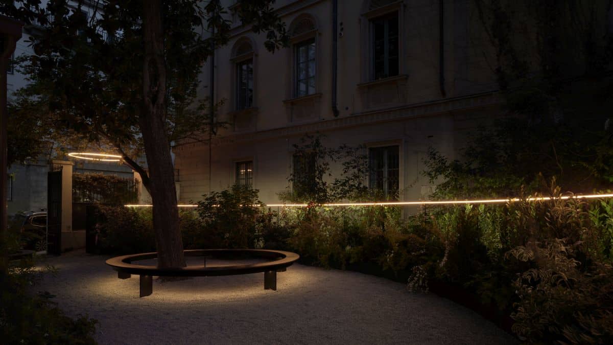
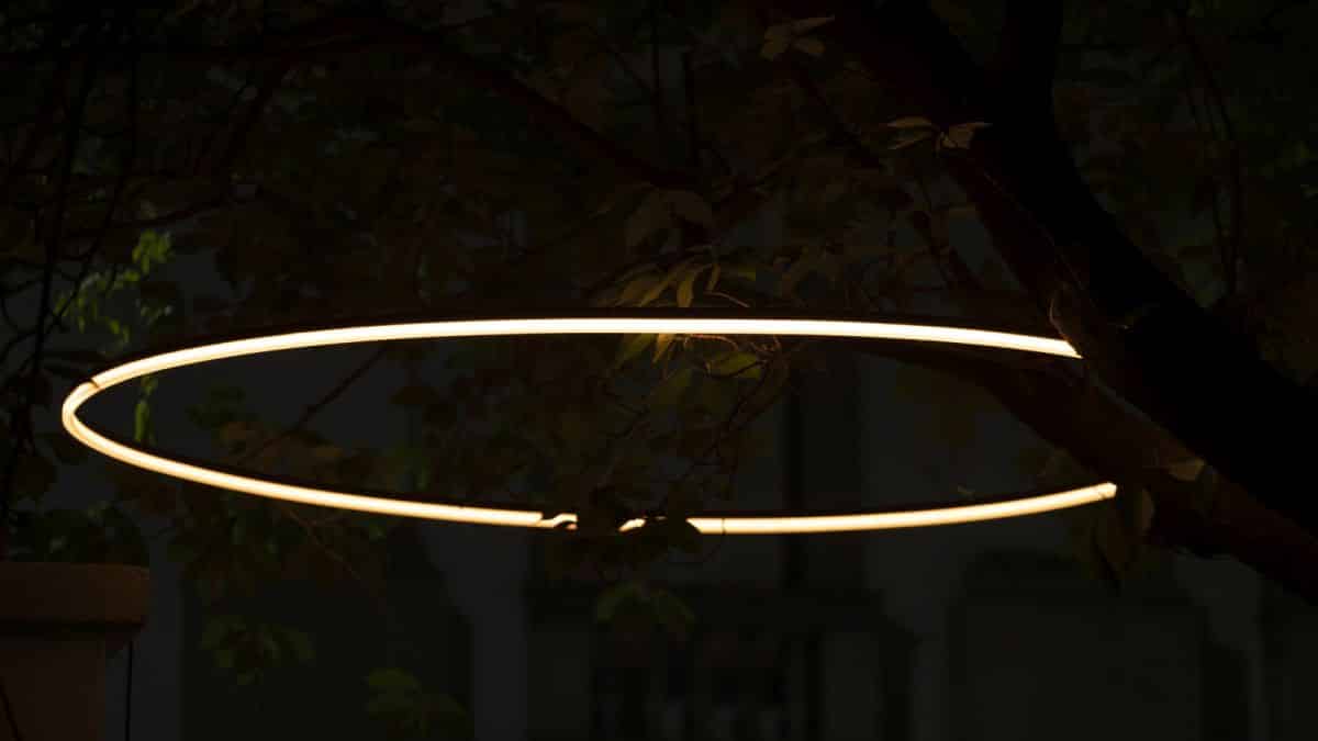
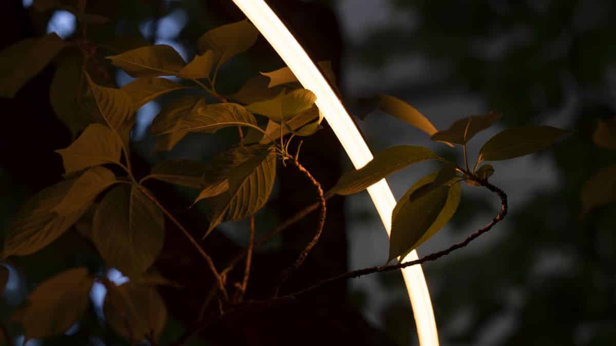
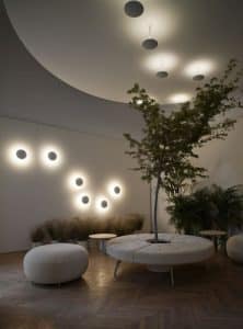
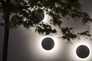
It is indeed a circle, more precisely a circle of light, that welcomes guests to the Qu showroom in Via Cernaia 7 in Milan, guests who, enveloped in a light that is at times softer, at times brighter, are about to visit the temporary installation “Infinitude. A circular lighting experience”.
An organic and integrated circular project that embraces the garden and the interiors, where light is the common thread of the experience: a concept by Parisotto + Formenton Architetti that stems from the desire to provide visitors with a complete sensory experience. Light and sound complement each other and converge in suggestions capable of taking one elsewhere as far as the cosmos.
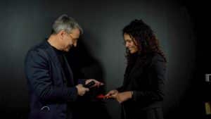
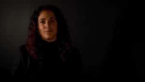
Waiting for us in this circle of light is Chiara Marzucco, former Vice President & Marketing Director at Quick Spa, who saw in the company’s Quick Lighting branch an opportunity to be relaunched, to the point of making it take on, with Qu, a dimension of its own.
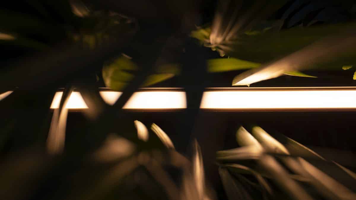
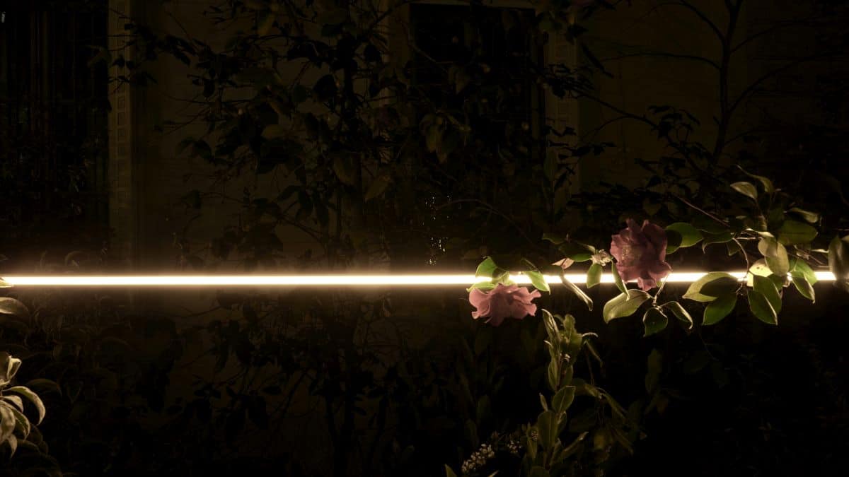
A long light ribbon guides the visitor through the courtyard; circles of light mark the garden as stages of the tour, intersecting with the trees present, and becoming signs, seats and patterns created by the light on the ground.
 What is the conceptual approach in Qu’s design idea?
“This year we said: we make a product, designed by architects and designers, but what we want to show is not necessarily the product. What we want instead is to make people have an experience. After various brainstorms we landed on this concept of the circle, which is one of the primary forms that, unlike others, is very democratic: it unites.
Then we combined this concept with the motion of light. At certain times there are very slow scenarios, and the light changes together with the music; we created a 15-hour scenario that varies very slowly, and each time it gives different suggestions, combining a very warm light with an amber one, while the counterfield is made of very cold light.
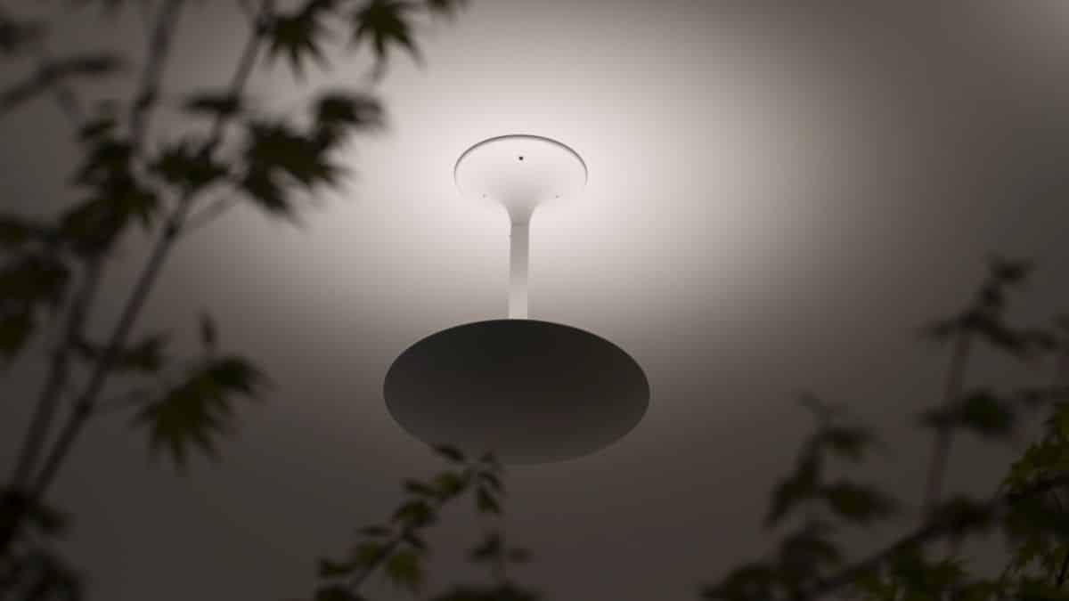
A nonsense in itself which, in this case however, makes sense because you don’t see the source, but you perceive this cold cloud behind it that is lunar, spatial: and here we connect to another theme, sounds. These sounds we hear are from the samplings made available by NASA, sounds from space, noises from galaxies and frequencies.
The guys from the Elion projectproject, who took care of this part, went and took different types of sounds depending on the time of day, so that in the morning or in the middle and warmer hours they came from Mars and the Sun, in the cooler hours of the morning, from the Moon, and later in the evening, from far away from the Earth.
This year’s concept revolves precisely around orbit, a dialogue between man and the space around.
No product is mentioned. Products are installed of course, like the Magritte, where again the concept of the circle returns, but that is not the focus. . In my opinion, light is not about selling a product, it is about union in one’s home, living a different experience depending on the time of day
 What distinguishes Qu from the market?
‘Let’s say that we wanted to distance ourselves a little from the classic product concept. Last year we used 3/4 families of lighting fixtures on the outside of the garden, and inside the same products are ‘exploded’ on a table: we did this as a provocation. As if to say: you see these are iron, electronics and cables, but these are elements that everyone has.
What changes is everything the company can do to either support the customer and/or give a vision in terms of light, giving support to the architect or designer, to achieve exactly what they had in mind’
More generally, in Qu’s concept, where does your inspiration come from?
‘From everything that comes into our hands every day Certainly we are connected to the theme of art, which is very dear to our company.
The real inspiration comes from the experience we have every day, when someone submits a problem to us. From there we start and from there we mutate, we change. Then we are going very fast, we don’t keep a single course, we mutate according to the challenges we are faced with.
I think we have found our dimension for now, but we are still changing a lot and we will continue to change a lot in the next three to four years’.
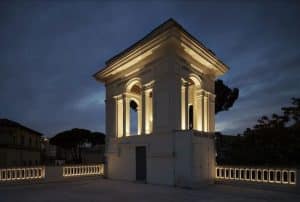 Two special works in which you were involved were the Cavalsassi school in Rome and the Nuove Cantine Italiane in Verona.
Here the light is almost poetic, it takes us into a story, what work does light do in contexts like these?
‘Light in my opinion is something that can enrich a project, and relying on an expert like a lighting designer is a very good idea, especially if he in turn has the foresight to rely on a company that can support him in his ideas.
In the case of Nuove Cantine Italiane, the set-up was done by Filippo Bricolo, a brilliant architect from Veneto, who needed to create this very imposing structure; it was a bit unusual because it was not flat, but had two planes that created a corner, and he wanted to create a light that could be integrated into the display itself.
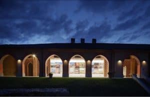 We needed a light that could illuminate the works without someone standing in front of them casting a shadow for themselves. We worked well with Filippo, he provided us with the space to stand in and his design idea, and gave us a lot of space on achieving the desired effect.
In the case of Cavalsassi it was a bit of the same thing. Marco Ferrelli took care of the project, and in that case we had to give value to this beautiful 1920s villa, but without interfering with the beauty of that historic building.
We worked from behind in the negative, to give accents on the windows, working with colours that could be completely integrated with the beam tubes. But you can hardly perceive where the light is coming from, which was the effect we were looking for.
You work in all situations, indoors, outdoors, public spaces, offices, residences. Is there an environment you particularly like?
For me, the outdoors is very beautiful and interesting. There is so much you can do, it is an environment that has been much more appreciated in the last 2/3 years. When we were looking for our showroom, the first thing I looked for was a place with a garden.
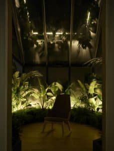 There is interaction between the elements outdoors. We do organic, biophysical light and greenery, with light that does not also interfere, but goes to create something new. In my opinion, a garden can be experienced in many different ways, by day and by night, with the same kind of light. So yes, as far as I am concerned, the outdoors is definitely my favourite. Then I come a little bit from the sea, so…’.
Here, let’s take a boating parenthesis. It’s a sector where light basically means furnishing, having space, that’s also an interesting aspect, isn’t it?
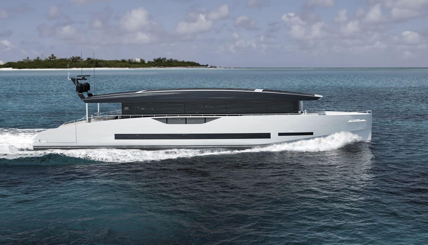
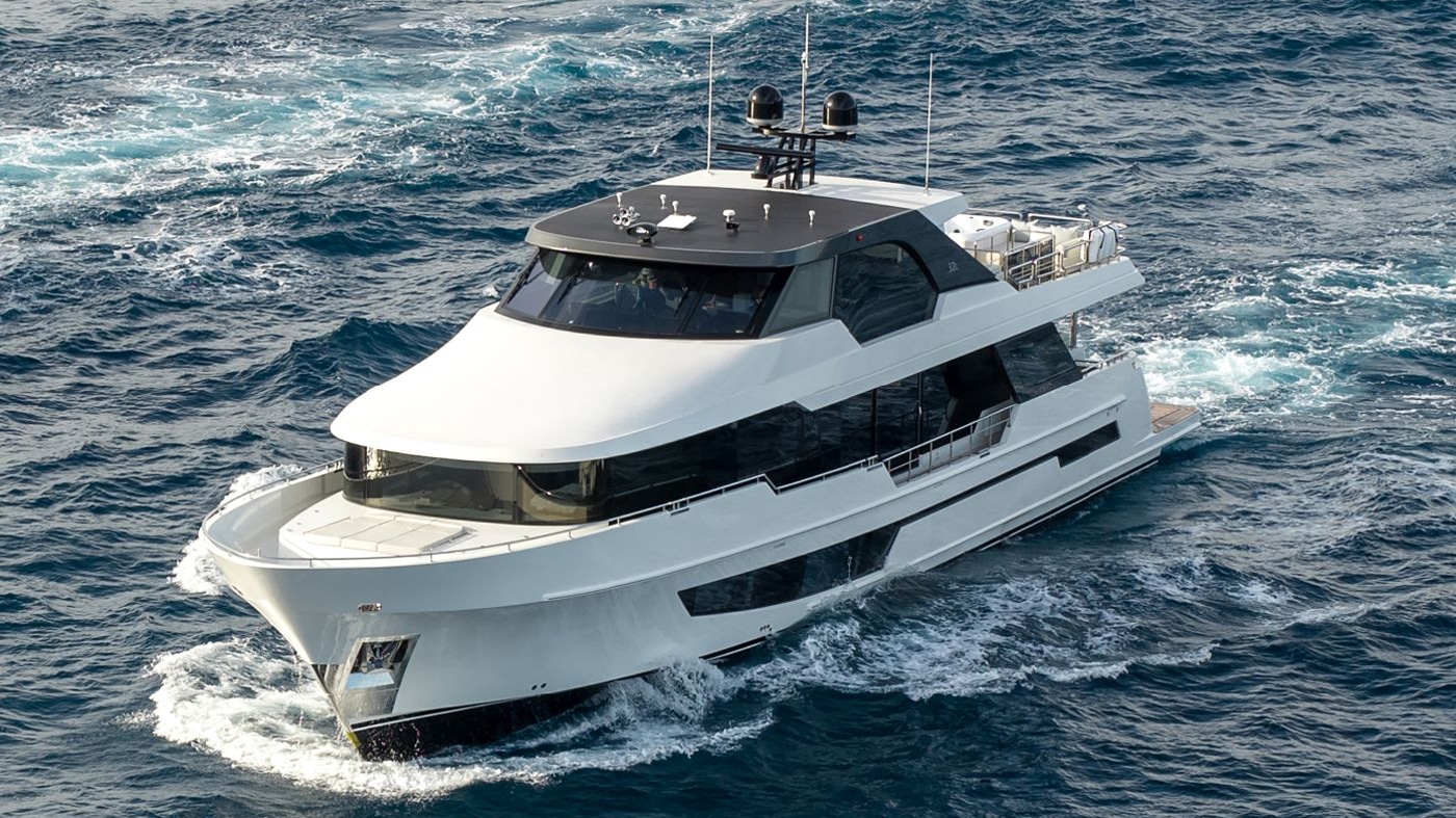
‘Qu doesn’t work directly in the boating sector, but it is a sector that I know very well and which the Quick Lighting division follows In my opinion, unfortunately it is still often the case that boat lighting is very price-dependent. And that’s a pity because it’s hard to understand that a boat, a yacht or a superyacht can change a lot depending on the type of product being used.
Who knows, even Qu can create an identity in this sense’.
 In conclusion, are there any future plans or particular ambitions that you have for the near or longer term future?
‘The first goal is not to disappoint. We are working and taking several projects abroad, so developing abroad with a dedicated showroom is near, but at the moment we are very focused on going step by step and experimenting.
We have plenty of time to grow, but right now the most important thing is not to disappoint expectations, everything else will come step by step. Besides, I’m superstitious!’

